As a design academic I've had the opportunity to study and teach design at a pedigreed school of design.
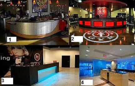
ego aside...let's look at these 4 versions of gym reception desks from an academic perspective, and talk it up, in a nice way. I always say the designs of my competitors are nice, and they are. My goal isn't to undermine the caliber of their work, I just want to bring you into the world of high design, as a form of higher art. And this isn't solely design, its also an opportunity to out market your competition.
These 4 designs are cliches that have been repeated so-so-so many times it boggles my imagination to think this type of reception desk design is a value to the client. Why?.. because the public has seen this aesthetic so many times it becomes pedestrian and predictable.
If I'm going to compete, then I want to DOMINATE, not follow the trends, and trends dating 20 years back... is not my idea of how to dominate your market.
As an aside, these designs do work for each brand, but these are pedestrian aesthetics
1. Moz (TM) metal plating over a curved desk front, pendant lights above. (Of course) a black granite countertop... I recall sketching these ideas in design school 20 years ago. This is very old design.
2. Back-lit red plastic panels bolted at the four corners to the face of the reception desk. Bolted "to anything" is an industrial mechanism of the 1800's...kind of Jules Verne. The dropped overhead soffit that follows the design of the countertop below, that's been exhausted. This is muscle gym design from the 80's.
3. Madonna's Hard Candy Gym's reception desk is Boutique Design trapped in the year 2000.It's
modern and says nothing about the client's brand, its just a modern desk.
4. A desk as math and geometry, everything is so perfectly aligned and calculated. I guess its nice, but kinda fascist modernist minimal 80"s architectural design.
Yes, we are being funny, but we are being truthful as well. The point is be unique, reject cliches, create a brand and upstage the competition.


 RSS Feed
