If you've ever followed success evangelist Tony Robbins you'll recall one of his paramount observations - that being - "success leaves clues". He also argues that one should "model" those attributes that are practiced by those whom we deem to be successful and hold in high esteem.
It should be clear by now where I'm going with this Post so I'll set forth a case for the brilliant branding platform that Planet Fitness delivers to the market.
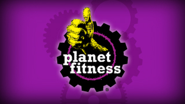
1. Logo: As gym logos go the PF Logo is a masterful work of two dimensional design communicating in simple graphics that which requires much in words. It embraces and telegraphs power and strength, it's a wonderful composition of the brand colors, it exhibits a 3D affect, and it's kinetic and powerful. The gear thing (in my opinion) is a touch point triggering one of two possible emotions. A tough machine-esque industrial gesture or a fun and youthful icon of our childhood playthings i.e., some possible Tinker Toy component. Regardless, this logo is a "bulls-eye" graphic icon when marketing to those who fitness goals are "frankly" not serious fitness goals. In contrast to those forever reoccurring gym logos that so many brands adopt, that which I chided in an earlier post - the swirly abstract man woman running figure - the Planet Fitness logo is better than those exponentially as a marketing effort.
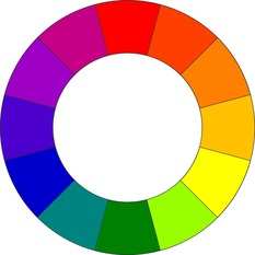
2. Brand Colors: Purple and Yellow may not be colors that one considers "gym-centric" however this is MUCH more than simply two colors. In the field of color theory, a complementary color scheme is one in which two colors are positioned directly opposite of each other on the color wheel (shown below). The intellectual argument for this arrangement is that the colors are at maximum contrast and maximum stability at the same time. The resultant effect is the cancelling out of each other's energy. Hence, they are physiologically neutralized, or better, perfectly balanced. In addition, their chromas (intensity and saturation of color) are cavalier and light hearted expertly targeting the intended demographic. That's a design intent smack down and well done at that.
3. Slogans/Social: Judgment Free, Lunk Alarm, No Critics, Pizza, Tootsie Rolls. Call it smart obfuscation, smoke and mirrors, hyperbole....take your pick, it's not the slogan/social footprint...gym industry people, it's the public outcry that brings a landslide of eyes on the brand...any publicity is good publicity, did Madonna not exploit this strategy? It's smart public relations, marketing and advertising, not poor fitness ideology...ummmm well that to.
4. Interior Design: As a design academic it took me a little time to unravel this mystery of interior design branding and I have come to believe PF got this really right, scientifically speaking, better than that, marketing wise. The interior design is mostly cosmetic, surfaces and paint and graphics, not so much finishes and architectural features, but that's just fine at their price point. More design would require a more expensive build out which would move the model "up in category and price" and "down in appeal to their demographic".
5. Blue Ocean: This is marketing for those who haven't heard of Blue Ocean Marketing, that is, finding customers in a larger sea of opportunities vs. fighting for the same customer that everyone else is trying to sell. Planet Fitness is wisely fishing were others have not, the largely unpenetrated non-fitness market. The KEY = have the right bait for the intended fish.
In conclusion, Planet Fitness is a business model that has shrewdly integrated design and branding across all platforms. Marketing, advertising, design, social and pricing unite in a seamless brand identity that expertly sells to their target demographic. Gym developers at any price point, low, mid or luxury, should model their own brand identities to those who have already executed this strategy successfully. To be clear, I'm not saying duplicate another brand. I'm arguing for a process that allows you to create your own identity by applying a best practices branding formula.
Learn more at: www.fitnesscenterdesign.com


 RSS Feed
